Instagram

Instagram

Tuesday, 31 December 2013

Radiant Orchid
Pantone Colour of the Year 2014


"A reach across the colour wheel to intrigue the the eye and spark the imagination"
"An enchanting harmony of fushcia, purple and pink undertones, Radiant Orchid inspires confidence and emanates great joy, love and health."
-Pantone-

image via tempodadelicadeza.com.br

Play with various shades of Radiant Orchid.

image via julianacaldeira.tumblr.com

Dare to stand out.

image via blogcontrast.com

Use as a striking accent colour.
Radiant Orchid tones complement olive greens, teal, turquoise and yellow and lift neutrals like grey and cream.

image by Katja
(Chelsea Flower Show 2013)

Wow with tall oversized flowers.

This should give you a few ideas on how to adapt the trend that will sure to dominate the interiors, packaging and catwalk for the next 12 months.

Kx


Happy New Year 2014!

Image via Brytizz

Fireworks in Pantone colour of the year 2014 - Radiant Orchid.

Time to bid farewell to year  2013 and welcome New Year 2014.
Wishing all every success for the year ahead.

Kx

Friday, 20 December 2013


Wishing everyone a magical Christmas!

image by clippings.com

Hope you have enjoyed and been inspired by all posts so far and a massive thank you to all for your continuous support and feedback.

Kx


Sunday, 1 December 2013

<a href="http://www.bloglovin.com/blog/11310861/?claim=4zn4sb7neqy">Follow my blog with Bloglovin</a>

Cool Yule

This one goes for all of you who enjoy the excitement of Christmas. Cold dark December evenings, roaring fires, mulled wine and all the gorgeous decorations.
Here are some of my favourite images to get you in the spirit of Christmas.

A festive front door sets the tone for a Christmas home. A stylish wreath is always a yearly must for me and a great way to welcome your festive guests.

Image by Twig Events
www.twigevents.co.uk

I love the modern take on this wreath. Simple yet effective combination of soft and hazy berry colours with festive greens.

Image by Twig Events

Including scented foliage like firs, dried limes, oranges and cinnamon is a more traditional take on a wreath that not only looks fabulous but also smells divine.

Image by Twig Events

A mantelpiece is a great place to let your imagination fly.
Decorate with big bold flowers and evergreens, candles and pine cones.
For the more minimal look, hang simple fairy lights and baubles.

Image by Katja
www.thedoortodesign.co.uk

Don't forget your staircase as this is a great place to showcase those gorgeous new decorations that you just had to have.

Image by Katja

How about creating your own special advent calendar and pack it full of delicious and special treats for your loved ones.
This white paper tree with lights is a fun, creative and personal alternative.

Image by Nicky Heard 
www.nickyheard.com

Time for a  touch of luxury and relaxation.
 Cosy up with these beautiful soft handmade cushions with elegant mother of pearl buttons.

 
Image by Nicky Heard

I would be delighted to find this throw gift wrapped under my tree.
Colourful, fun and versatile for that someone special this Christmas.

Hope I have succeed in getting you in the mood for the festive season!
Don't forget to check out 
www.twigevents.co.uk for your floral needs
and 
www.nickyheard.com for all those luxury gift ideas.

If in need of styling advice or interior design services, drop me a line 

Kx


Saturday, 16 November 2013

Chalet Chic

As these dark winter nights are well and truly upon us now I decided to share some of my favourite Chalet looks with you.

There is nothing better than packing your bags, ready to head out to the mountains.
What could be more relaxing than taking in the scenery of snowy mountains, breathing the crisp fresh air and at the end of the day, chilling out under a cosy blanket by a roaring fireplace.

There is something timeless about most Chalet interiors. The use of timber, sumptuous furniture, faux fur throws and cushions create the most warm and inviting surroundings to relax in and really welcome the cold winter evenings.

Image pinned from blissfulb.squarespace.com

Loving the weathered timber beams, flooring and walls.White comfy sofa accessorized with grey cushions and throw gives this space a contemporary twist.

Image pinned from mechantdesign.blogspot.fr

The dark tones and luxurious materials creates a certain mystery to this bedroom deco.

Image pinned from 25.media.tumblr.com

How about enjoying your evening feast in this beautiful dining space.
Exposed brick walls work well matched with contemporary Eames rockers, rustic chandelier and the open log fire.

Image pinned from kimmcleoddesign.files..wordpress.com

This interior demonstrates that Chalet Chic doesn't always have to stay in the mountains.
Industrial wallpaper and neon artwork mixed with grand armchair, soft tartan and a few antlers gives this room that eclectic feel full of attitude.

My lift pass in my pocket, I hope you too will be able to enjoy a few winter days in the mountains soon.
I hope I have not only warmed you up but also inspired you to create a cosy snug to retire to after a busy day.

Kx


Tuesday, 12 November 2013

Get ahead for Christmas

Strolling down London's Kings Road yesterday, admiring all the beautiful Christmas windows, it dawned on me that there is only six weeks until the 25th December.

Most of us love visitors but it might all seem a little overwhelming especially at Christmas as the expectations and emotions run high.

I figured it might be quite handy to share some ideas with you of how to get ahead of the game.

Hallway

First impressions always count, so be sure to have your hallway or entrance hall in tip top order.
You might want to just de-clutter your entrance from coats and shoes and make sure you have enough hanging space for your guests belongings. Maybe add a hook or invest in a funky coat stand.
You might want to add a fresh coat of paint to walls and ceiling to brighten up the space.
Think about adding a statement chair , stool or a bench near the entrance and perhaps, hang a picture or two or a statement mirror on the wall.
You can add warmth by placing a rug or runner and finish off the ambience with Christmas decorations, scented candles and twinkly lights.


Image pinned from home-styling.blogspot.pt


Image pinned from lenebjerre.dk

Guest Room

Whether you have family visiting or friends staying overnight, a spare bed or a sofa bed will be a bonus.
Consider refreshing the spare room by creating a feature wall with paint, hang some gorgeous new wallpaper or add some artwork to the walls.
Invest in new bedding. Crisp white linen will work every time and keep gorgeous throws and blankets handy for extra warmth and comfort.
Set up a bedside table, add lamp, alarm clock and reading material for a homely touch.


Image pinned from fatherrabbit.tumblr.com

Living Space

De-clutter your living area and make sure you have enough comfortable seating for everyone.
Comfy, large cushions work well also for seating on the floor, if space is tight.
Add small tables for drinks and nibbles or have plenty of trays to hand.
Light plenty of candles and light the fire to add to that relaxed holiday feel.


Image pinned via Stylekiu


Image pinned from desiretoinspire.net

Bathroom

If the bathroom is looking tired and neglected this could be a great opportunity to sort it out.  But as time is limited, I would just advice you to tackle some minor issues that might just be enough to bring the bathroom up to scratch. 
Clean, clean and clean. Scrub all surfaces till they shine again, sort out any leaking taps and shower heads.
Ensure visitors have new fluffy towels to hand and invest in some gorgeous new bath products.
Home fragrance oils and scented candles always help.

Cloakroom

This is the one room that I can guarantee will see a lot of visitors over the holiday season, so try and make it interesting. Try hanging some quirky wallpaper as this often works brilliantly in smaller spaces.
Alternatively think about hanging photos or pictures. Make it fun!
Remember to put out luxury soaps and hand cream, not forgetting fresh hand towels.


Image pinned via First Sense

All this done, it's now time to sit back, relax and wait for the guests to arrive.
Enjoy! Kx


Monday, 21 October 2013

Scandi Interiors and Design Classics

As of Friday, I am jetting off to my motherland Finland for a brief visit and wanted to shed some light on scandinavian design and interior style, as I know it.

The beautiful landscape is an inspiration to many and as we have the full on four seasons on the weather front, most of us still need to be practical. We try and make our homes feel open, cosy and energised at all seasons. 
What sums up scandi style for me is it's simplicity, minimalism and functionality.

Image pinned via Eighty Ate

As apartments are hugely popular in scandinavia, space is often tight. Natural light and clever use of artificial lighting is vital, especially in the dark winter months.
White is often used as a base colour, and a choice of accent colours are usually carefully chosen to create interest.
Natural materials are favoured and texture added by accessories.
Old and restored tiled stoves can still be found in many buildings and make a great statement piece.

Image pinned via Anne-Claire Roberts

This is a gorgeous office space.
Very eye catching. Monochrome palette used to the full stylish scandi way.
Ikea pieces mixed with high end Eames classic chair to the maximum effect.

Scandinavia benefits from a vast heritage of internationally recognised designers. From Alvar Aalto and Arne Jacobsen to todays big names Harri Koskinen and Klaus Haapaniemi, only to name a few.

A classic Egg Chair by Arne Jacobsen, would not look out of place in any scandinavian interior.
I love the simplicity, look and form of the design. It still, after all these years, takes my breath away.
(Unfortunately, over used and copied in places, but still strongly on my list)

Image by Katja Kapulainen

One true beauty I fell in love as a child, is the Artichoke pendant by danish designer Paul Henningsen.

The Artichoke was originally created in 1957 for the Langelinie Pavillion in Copenhagen.
The design was developed extremely quickly as only very few rough sketches exist from before installation in the Pavilion. The design evolved by PH experimenting his various designs into one.

Today, the Artichoke is manufactured and available in various sizes and finishes. 
 Personally, I find the brushed copper shades with weak pink colour on the inside, a total overall favourite. 
Subtle, calming elegance and in this seasons trendiest interior finishes. Bonus!

Image by Katja Kapulainen

Last but not least, scandinavian interiors are not necessarily all white, wood and classic masterpieces.
far from it....

Image by Marko.fi

As it happens, this image is from my nearest and dearest friend's apartment in Helsinki.
She has an impeccable taste, especially when it comes to mixing vintage quirky finds and colour with contemporary classics.
A brave and strong statement with Farrow and Ball paint on the walls, vintage sideboard themed with an antique candelabra and a classique white Diptique  candle.
Works!
(See you Sunday, Helsinki way!)

Kx


Saturday, 5 October 2013

HK119
IMAGINATURE 

Collection of fabrics and fashion by Heidi Kilpelainen

 I would like to introduce you to a fellow Finn, Heidi Kilpelainen.
A talented Finnish multimedia artist, singer, recording artist, Central Saint Martins graduate and a fashion and fabric designer.

Heidi's career has been nothing but exciting. She has performed in many venues internationally and in the UK. Gathering a famous fan base.
You can find out more about Heidi's music career at 
and hear her new album Imaginature at


I happened to catch up with Heidi to discuss "the latest happenings" and to chat about Heidi's inspiration behind her latest exiting adventure.

IMAGINATURE

A collection of very artful and unusual fabrics, printed from Heidi's collage of photographs of the Finnish landscape and nature.

"Moss"

"Puddle"

Heidi describes her inspiration as part of  an "awakening", she experienced during a visit to her homeland, Finland.
With the busy urban life left behind, Heidi concentrated on the peaceful surroundings of northern Finland. Waking up to the amazing scenery and the tweeting of birds.
By fully reading Kalevala, a 19th century work of epic poetry by Elias Lonrot, awakened Heidi's creative senses.
The Finnish and Karelian folklore and mythology, played a big part in creating her latest IMAGINATURE collection.

Heidi's collection of fabrics are all her own images of Finnish nature printed on silk or cotton.
Clever images of moss, rock, birch trees to name a few. If you care to have a look, I will guarantee they will blow you away.

A collection of the fabrics hanging in the wind.
"Moss" and "Puddle"
I fell in love with these fabrics  when I styled Heidi's photo's. What a versatile design for interiors. The fabrics could  and should be used as throws, picnic throws, cushions, table covers , curtains, pillowcases or displayed as pieces of art.
"Puddle Grass"

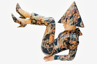
Heidi designs all of her stage outfits and she can most often be seen performing with a signature headpiece covered in matching fabric.

 Here are some of my favourites;

"Dark Rock"

"Rock"


"Puddle Grass"

Three photos above by Vicky Churchill


I hope you have been entertained and fallen in love with the pieces.

If you would like to purchase any items from the Imaginature collection, please quote BLOG, as Heidi is currently offering a 15% discount to my lovely readers.
(Offer valid between 5th - 12th October 2013)

You can contact Heidi at www.hkimaginature.co.uk
Or any bespoke interior ideas you might want to discuss with me Katja at www.thedoortodesign.co.uk


Wednesday, 2 October 2013

Some other inspiration from Decorex 2013

Give your interiors a lift by upholstering tired furniture with some wacky fabrics.

Splashes of colour always brightens up the day.These juicy tones are perfect for the autumn.

Playful monochrome wallpaper works perfectly with copper  accessories.

What a bold statement. Brave enough to go for full on pattern on pattern?

Marvellous marble.
Symmetrical marble tiles will give any bathroom  the luxe feel.

Fancy accessorising your mantelpiece with "object de curiosite"?

Great lighting is sometimes all you need, it can make or break a deco scheme.
I fell truly in love with this contemporary collection of table lamps.
These clever pieces provide both direct and indirect light with style.

Tuesday, 1 October 2013

Decorex 2013

The event of the season for interior designers- Decorex

I was lucky enough to grab a seat to hear about the inspiration for this years entrance stand by the world famous interior's expert Kit Kemp, Silk Route.


Silk Route was, by Kit Kemp, inspired by a traveller. 'The Weaver Of Dreams".
Colours used on the display started their journey, as the traveller experienced different cultures, colours and countries. From spice markets to wherever took the travellers fancy.

The crystal galleon, hang above the stand, guides you through the dreamy world of "The Weaver Of The Dreams" to a more cosy atmosphere.
Quirky guesthouse?


 So many details to take in. 
If you guys need any help, let me know www.thedoortodesign.co.uk


A detailed picture of a lampshade made out of plastic water bottles.


100% Design

An essential destination for any designer during the Design Week. 
For me, it's always a highlight to check out new designers within Emerging Brands.


I got very excited about this new design company, Buster and Punch.
Their story started from a small garage in east London where they discovered their passion and talent for customising things that they love, from motorcycles to light fittings.


Buster and Punch specialises in creating daring and exquisite home products.
I adore these two shots, as they represent the philosophy behind the brand and captures the luxury of a bespoke design.


There really is no excuse for boring walls anymore.
These black wall tiles will add instant glamour and luxury to a deco scheme.
These would look fantastic in a "gentleman's den" or as a backdrop in a trendy office space.
Makes me feel all moody and mysterious, you?


Managed to snap a photo of these cool door knobs.
Industrial feel with wings and skulls.
A fresh way to update a dresser perhaps and ideal for a teenager's bedroom.
( I am actually imagining these skulls as buttons on my biker jacket)


Last but not least, white!
I am a sucker for the Design Classics. 
Pure simple design with a little specific detail. Gets me everytime.
What a standalone showpiece, yet at the same time, a functioning piece of everyday furniture with sustainability and class.